David Bitnar
November 08, 2024
The rise of bots and AI has brought exciting possibilities, but designing an AI-first experience in structured business applications presents unique challenges. Our goal is to ensure these interactions feel intuitive and familiar, making the user experience seamless within the Microsoft ecosystem.
Key Principles for Designing Teams Apps
We use Fluent UI and React to ensure our Teams apps look and feel native to the Microsoft environment. This approach aligns with Microsoft's design guidelines and allows us to build dynamic, responsive interfaces that handle complex workflows efficiently, providing a familiar experience to users.
Balancing Structured Inputs and AI-Driven Flexibility
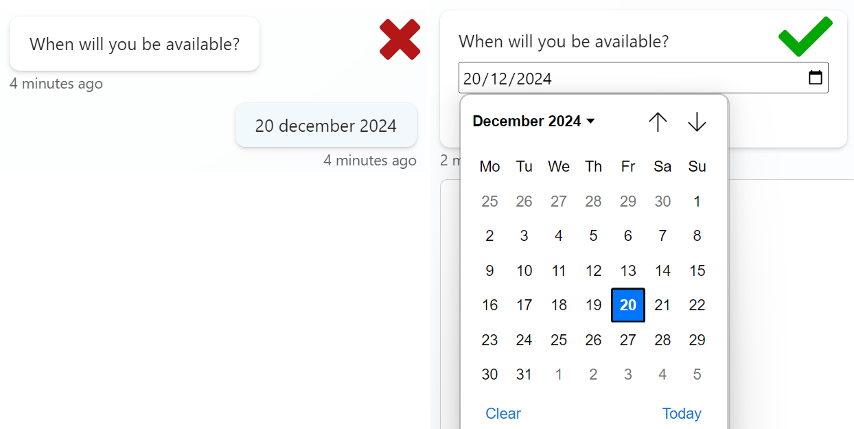
Traditionally, business apps rely on forms, checkboxes, and dropdowns—simple and precise tools that users are familiar with. While AI-driven chat adds flexibility and natural language interactions, not everyone is comfortable with typing out long answers or details like dates. That’s why we bring the best of both worlds by keeping some familiar elements from traditional forms.
For example, we use adaptive cards to show a calendar picker for dates or checkboxes and multi-select options for quick choices. This approach allows users to interact with the AI in a way that’s both modern and intuitive, while still providing the precision and speed of traditional structured inputs.

Enhancing User Control with Sorting and Search
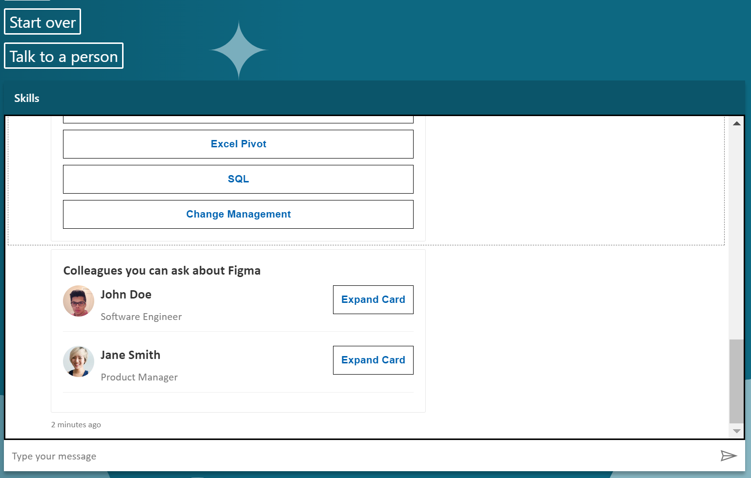
When dealing with long lists—whether of colleagues, files, or projects—it’s important to provide users with tools to sort and filter. This allows them to quickly narrow down results and find exactly what they need without wasting time scrolling. In our Teams apps, we incorporate these features to ensure that users can efficiently manage their data and tasks, improving both the speed and quality of their experience.
Restarting and Resetting for a Better User Experience
One of the core aspects of any app or bot interaction is ensuring users don’t feel lost or stuck. We always provide the option to restart or reset the conversation or interaction flow, allowing users to backtrack or start over if needed. This feature is critical to keeping users in control of their interaction, ensuring they never feel frustrated or trapped in a confusing flow.

Rapid Prototyping with Copilot Studio
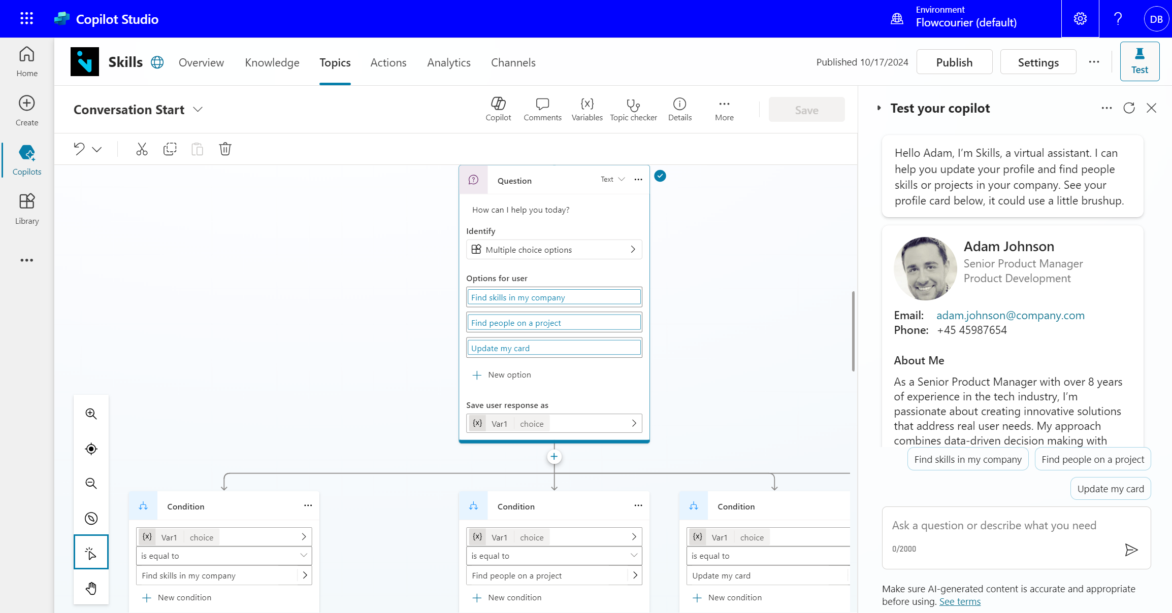
When building these experiences, we rely on Copilot Studio to design and prototype flows rapidly. This allows us to quickly iterate on different user journeys, test conditions, and demonstrate how adaptive cards and other UI elements will function. By working in a fast, iterative environment, we ensure that our apps and bots are user-friendly before they are fully developed and integrated with APIs and backend code.

UI/ UX Journey with Flowcourier
At Flowcourier, we understand the unique challenges and opportunities that come with designing AI-driven experiences in Microsoft Teams apps and chatbots. Our goal is to bridge the gap between innovative AI capabilities and structured business workflows, ensuring users feel in control, supported, and empowered throughout their interactions. By combining Microsoft-native tools like Fluent UI, adaptive cards, and Copilot Studio with a user-first approach, we create solutions that are intuitive, flexible, and tailored to your business needs. Whether it's managing data with ease, enhancing collaboration, or enabling seamless communication, we are here to design experiences that keep both users and stakeholders in the loop.
Lets build something great together
Reach out to us to start designing Teams apps and chats that feel comfortable, natural, and effective for your business. Flowcourier is ready to help you navigate the future of AI-driven solutions.